Stuart Davis: Socko, Boffo
A closer look at an often underappreciated 20th century painter
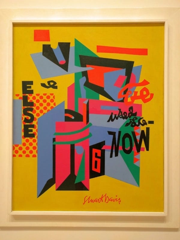
(This article was originally published in 2016)
I went to see Stuart Davis: In Full Swing at the Whitney Museum here in New York yesterday. I have always liked his paintings very much when I’ve come across them, though he’s not a painter I ever turn to for direction or inspiration. He doesn’t get the attention he deserves generally, and there hasn’t been a major exhibition of his work in this country in 25 years as far a quick search will tell you. Perhaps because, born in 1892, he came of age between the slow emergence of abstract art in the United States following the Armory Show of 1913, which brought contemporary European ideas to New York, and the rise of the abstract expressionists after WWII, who were about a generation younger than Davis. That said, looking at Owh! in San Pao (above), you would be hard put to find an American painting from the early 1950s that outdoes it in terms of sheer visual punch and integrity, no matter how much drama employed in the making. Let it also be said that Davis was an admirer and advocate of many of the abstract expressionist painters. There’s a nice interview with Barbara Haskell, co-curator of the exhibition, on WNYC radio that gives an overview of Davis’ career.
The two things that were so impressive about the paintings in this retrospective were the genius of design and the striking color sense.
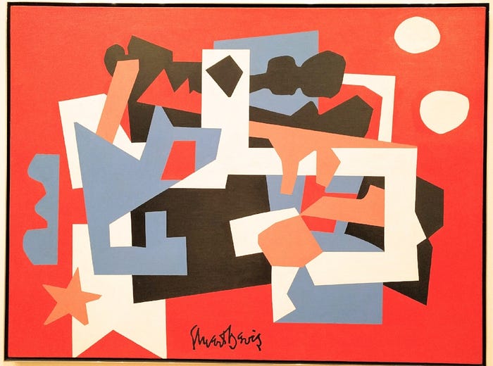
Colonial Cubism, for instance, is a master class in design for five colors. Davis often uses a bold background color, and the relatively equal proportions of the other colors along with the sharp angularity of the shapes make the design intensely dynamic.

Egg Beater №1 is an earlier example employing curves and more neutral colors. The shapes here shy away from the edges, which attenuates the graphic tension.
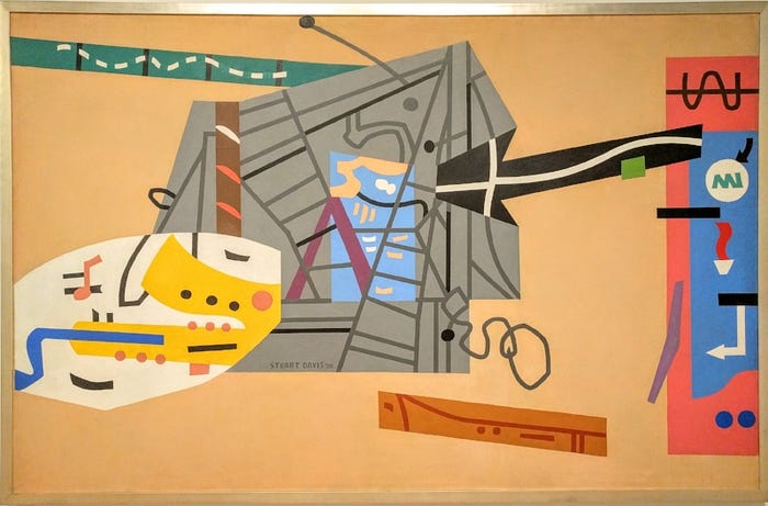
It doesn’t come through as well in a small reproduction, but the scale and shape of the negative spaces in the wall-sized WNYC mural, a Federal Art Project commission, are magnificently calculated. I couldn’t take my eyes off this painting for almost 10 minutes.
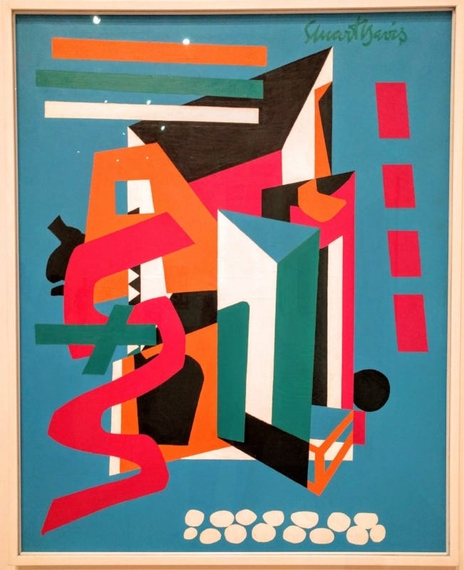
Like many of Davis’ paintings, Medium Still Life is powered by a dynamo of complementary colors, in this case a blue just shy of maximum intensity paired with orange, with chunks of magenta thrown in to up the heat.
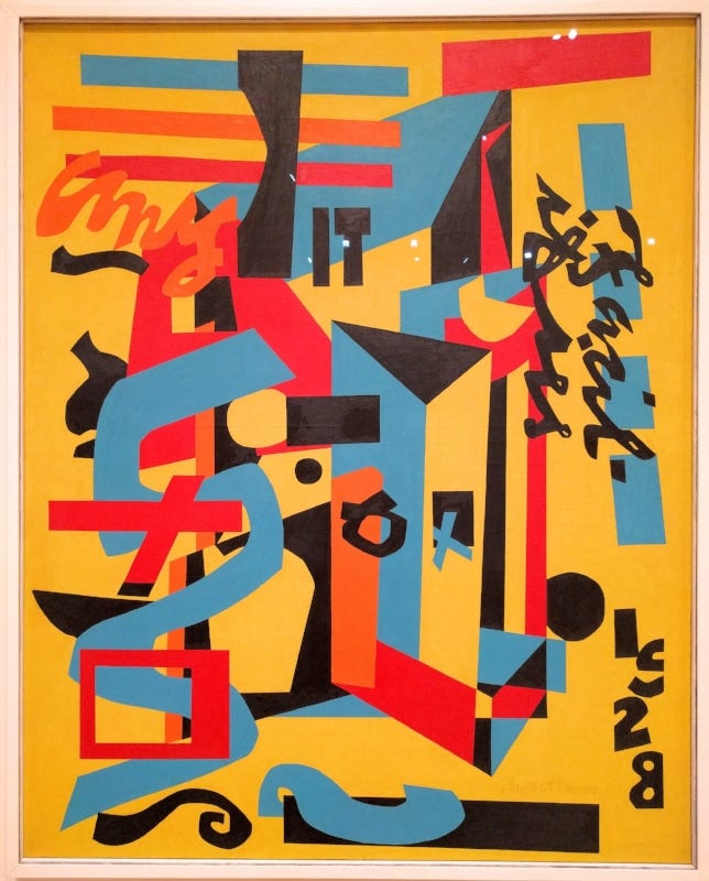
And Davis’ color isn’t just intense. A hint of neutral or other admixture makes the palette slightly off-kilter and more intriguing than if pure color were used exclusively. It’s as if he set the color dial on the most saturated, centered colors and then turned the knob a couple small clicks to the left, blues not quite pristine blues, yellows with a breath of sulphur.

Davis worked on this painting the night he died. You can see in the first detail (below) the masking tape still on the canvas, and in the second the unfinished words, which are of interest as they give some insight into his design method. The letters are not drawn first and then filled in; they are built out gradually to give him more control over their size and relationship to the other elements of the painting as they develop around the words. It reminds me of anecdotes I have heard about Piet Mondrian (whom Willem de Kooning, who once worked in advertising, called admiringly “the best layout man in the universe”), who would painstakingly repaint the same line, slimming it by 1/16 of an inch, moving it microscopically to the right, over and over. It matters.
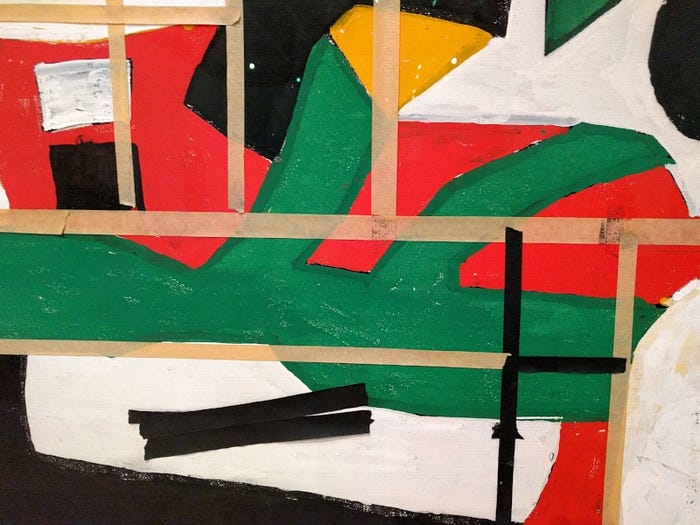

The night Davis died, he had watched a French film, and afterwards painted “Fin” on the painting. He went out of that studio feet first. You can’t ask for more than that.
Originally published at https://www.quirkblog.net on September 24, 2016.
